Decode any lettering. Name that font.
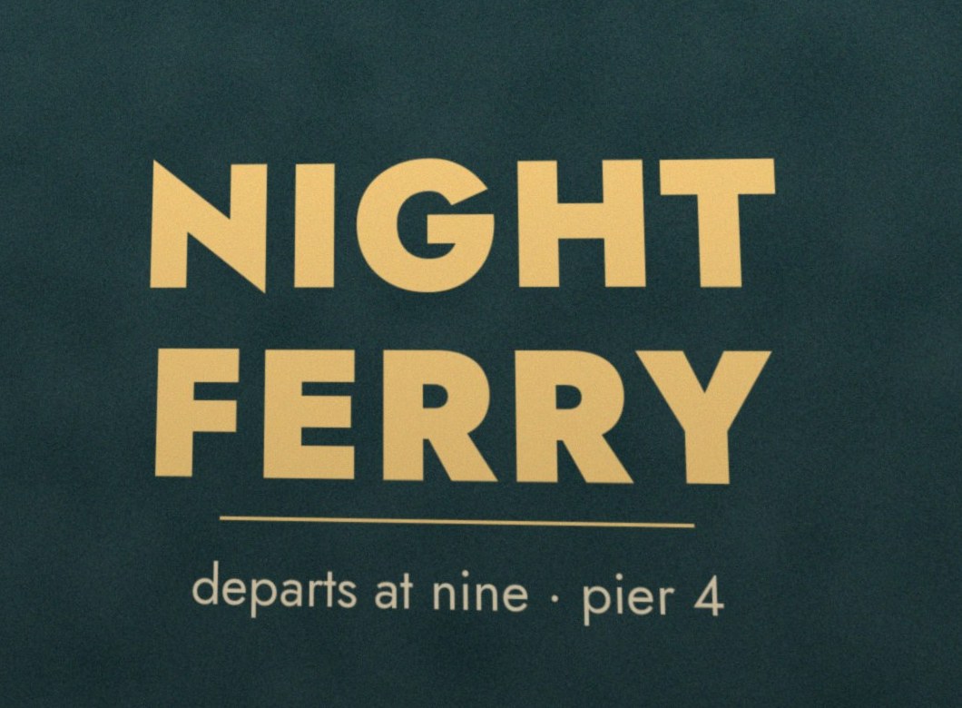
Futura, the font Jost is drawn after, is released by the Bauer Type Foundry in Frankfurt. Designer Paul Renner built it from circles, triangles and squares, in the spirit of 1920s modernism. It is often linked to the Bauhaus, though Renner never taught there.
Futura spreads worldwide and becomes the default “modern” sans for advertising, signage and packaging. Foundries in other countries make their own close cousins.
Jost is a free, open-source family by Owen Earl (indestructible type*), on Google Fonts. It carries the same 1920s geometric idea, with weights from Thin to Black, so you can use the look without a licence.
The plaque Apollo 11 left on the Moon in 1969 is set in Futura.
Volkswagen’s 1959 Beetle ads by the agency DDB used Futura, and became one of the most studied campaigns in advertising.
Supreme’s red box logo is Futura Heavy Oblique, a nod to the artist Barbara Kruger’s text works.
Wes Anderson has leaned on Futura for titles and credits across many of his films.
Look at the pointed apexes of A, M and N, the perfectly round O, and the very tall ascenders on b, d and h. Many look-alikes square off the M or shorten the ascenders.
Mock content. In the app every fact links to its source; if no source is found, foaly says so.
Photo recipes to recreate any look.

One warm, soft light from above and slightly left: bright crisp highlights on the cup’s rim and the spoon, a gentle shadow falling down-right. It reads as indoor café light, not daylight.
Low-key. Most of the frame sits in the darker half, the corner behind the cup drops to near-black, and only the cup’s rim and spoon touch white. Nothing important is clipped.
Almost one colour family: rust, terracotta, espresso brown and crema tan, held together by a strong warm cast. No cool tones anywhere, which is what makes it feel cosy.
Sharp on the cup, saucer and wood grain in the front; the far side of the table softens away. A moderately wide aperture, close to the subject.
High angle, about 45° down. Cup slightly left of centre, saucer filling most of the frame, wood grain running diagonally top-left to bottom-right. Dark empty corner top-left balances the bright cup.
Why Direct sunlight: under warm café light it keeps the warmth instead of neutralising it, and A2 pushes a little more amber.
Mock. Values come from measuring the photo (numbers above) plus a written read of it; the real app checks every value against the Z fc’s ranges.
Point at anything, get its colours.
How it works: foaly shrinks the picture, sorts every pixel into about 30 colour families, then keeps the ones that cover the most area and are clearly different — always including the darkest and lightest tones. CMYK is approximate; print values depend on the printer’s profile.
Send foaly anything. It sorts it and has it ready.
Android: foaly appears in Share once installed. iPhone: a “Send to foaly” Shortcut does the same job.
Forward anything to chute@foaly.app: links, receipts, newsletters, attachments. Only your addresses are accepted.
Bookmarks can sync on their own through X’s API (a paid tier), or you share a post to foaly for free.
Instagram doesn’t let other apps read your saved posts, so share the post to foaly (or copy its link) instead.
One click on “foaly this” sends the page you’re on, with any text you’ve selected.
Message a foaly number with links, photos or voice notes. Needs a WhatsApp Business number.
Paste a screenshot or drag files anywhere on foaly.
Hold to speak; foaly transcribes and files it.
Mock items. A quick AI look at each item picks its home; when unsure it asks, as on the jacket.
Stuff I liked — from a fashion eye.
Mock pins (drawn placeholders, no real products). In the app these are your own photos, screenshots and links.
Mock numbers. AI spend is an estimate from usage, shown as totals only (as in Elephant).